11
JPG vs PNG vs WEBP: Which Image Format Should You Actually Use.
JPG, PNG, or WebP — which one should you actually be using? We break it down the way no tutorial does: real scenarios, real mistakes, and a clear answer for every situation.
JPG vs PNG vs WEBP: Which Image Format Should You Actually Use?
I once spent three hours trying to figure out why my website was loading like it was still 2004 on a dial-up connection. I'd done everything "right" — compressed my CSS, minified my JavaScript, even switched to a faster host. But the pages still dragged.
Turns out, I'd been uploading raw PNG screenshots for every single image on the site. Some of them were 4MB each. I had eleven images on the homepage.
You do the math.
That painful afternoon taught me more about image formats than any tutorial ever did. And since then, I've helped a handful of freelance clients fix the same exact problem — usually without them even knowing it was the problem. So let me save you that same afternoon of frustration.
Let's Skip the Textbook Stuff
Most articles on this topic open with something like "JPG stands for Joint Photographic Experts Group…" and immediately lose half their readers. You don't need that.
What you actually need to know is which format to use when, and why picking the wrong one is quietly wrecking your site's performance, your email attachments, or your design deliverables — depending on what you're building.
So let's talk about these three formats the way someone who actually works with them every day would.
JPG: The Workhorse You've Been Using Since Forever
JPG (also written as JPEG — they're the same thing) is the format that built the internet's photo library. Your holiday pictures, product photos, food pics on Instagram before you uploaded them — almost all JPG.
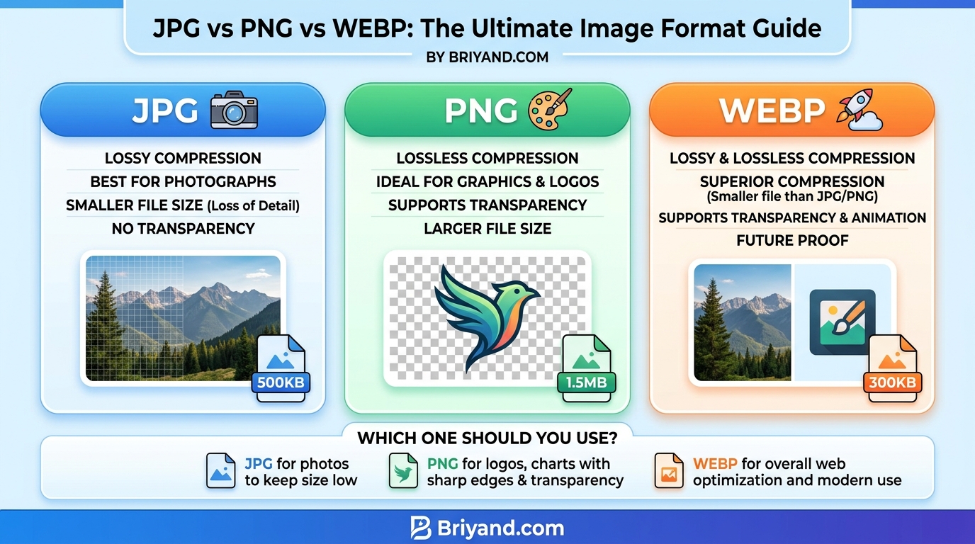
Here's the core thing to understand about JPG: it throws away data to get smaller. That's called "lossy compression," and it's not inherently bad. The algorithm is smart enough to discard information your eye won't really notice — like subtle variations in a blue sky, or the texture of a wooden table in the background.
The result? A photo that might originally be 15MB as a raw file becomes a 300KB JPG and, honestly, looks nearly identical to most people on most screens.
Where JPG absolutely shines:
- Photographs. Portraits, landscapes, product shots, food — anything with lots of color gradients and natural detail.
- Blog post featured images.
- Social media uploads (before the platform recompresses them anyway).
- Email newsletters where file size matters.
- Anywhere you're dealing with a camera-taken image and need it to load fast.
Where JPG quietly fails you:
This is where I see people make mistakes. JPG handles smooth color transitions beautifully, but it hates sharp edges, flat colors, and text.
Ever saved a screenshot of a website or a logo as a JPG and noticed weird blurry artifacts around the text and edges? That's the JPG algorithm getting confused by hard transitions. It introduces what's called "compression artifacts" — blocky, ringing distortions that are especially obvious around logos, icons, and anything with clear lines.
Also — and this is important — every time you save a JPG, you lose more quality. JPG compression is permanent. If you open a JPG, edit it, and save it again, you're compressing an already-compressed file. Do that ten times and you'll visibly notice the degradation. Always keep your originals in a lossless format (RAW, TIFF, or PNG) and export to JPG as the final step.
Best quality setting for web: Export between 70–85% quality. Below 70% and you start to see artifacts. Above 85% and the file size jumps without meaningful visual improvement. I use 80% as my default and rarely look back.
PNG: The Perfectionist's Format
PNG is what you reach for when quality cannot be compromised. It uses lossless compression — meaning it makes the file smaller without throwing anything away. What goes in comes out exactly the same.
The use case that immediately makes sense: transparency. PNG supports an alpha channel, which means parts of the image can be partially or fully transparent. Drop a PNG logo onto a colored background and it blends perfectly, because the white corners that would ruin a JPG simply don't exist in a well-made PNG.
Where PNG is the obvious choice:
- Logos, icons, and branding assets — especially ones with transparent backgrounds.
- Screenshots of apps, websites, dashboards — anywhere text needs to be crisp.
- Illustrations, diagrams, charts, and infographics.
- Anything you'll edit again later (treat it as your working file).
- Images where fine detail, sharp edges, or text are prominent.
The PNG problem nobody talks about:
PNG files are big. Not just a little big — sometimes absurdly big.
A photograph saved as PNG can be 5–10x larger than the same photo in JPG format, with no visible difference to the human eye. I once worked with a client whose "team photos" page was loading in 8 seconds. Every headshot was a PNG because their designer delivered the files that way and nobody questioned it.
Swapping those to JPG at 80% quality cut the page load time to under 2 seconds. Same visual result. Eight times smaller files.
So the rule is: use PNG for graphics and logos, use JPG for photographs. Breaking this rule in either direction costs you either quality or file size.
A note on PNG-8 vs PNG-24: PNG-8 supports 256 colors (smaller file, good for simple graphics), while PNG-24 supports millions of colors with transparency (larger file, needed for complex images). Most tools default to PNG-24. If you're exporting a simple icon with a few flat colors, forcing PNG-8 can dramatically shrink the file.
WEBP: The Format Google Built to Make the Web Faster
WebP came out of Google around 2010, and for years it was the format that everyone talked about but nobody fully used because browser support was spotty. Safari didn't support it until 2020. That was a dealbreaker for a long time.
But it's 2026 now, and WebP support is basically universal across every modern browser and device. There's very little reason not to be using it, and yet — based on what I see when I audit client websites — most people still aren't.
What makes WebP special:
WebP does something neither JPG nor PNG can do individually: it offers both lossy and lossless compression modes, and it supports transparency. It's essentially trying to be the only image format you ever need.
The numbers back it up. According to Google's own benchmarks (and independently verified by many developers, myself included), WebP images are typically:
- 25–34% smaller than JPG at equivalent visual quality for lossy compression.
- 26% smaller than PNG for lossless compression.
Those are significant savings. On a page with 20 images, switching from JPG to WebP could cut your total image payload by nearly a third with zero visible quality difference.
Where WebP wins clearly:
- Any website where page speed is a priority (which should be... every website).
- E-commerce product galleries — where you might have dozens of images per page.
- Blog posts, news sites, portfolios — anywhere images are central.
- PWAs (Progressive Web Apps) where you're trying to squeeze performance.
Where WebP has quirks:
WebP isn't perfect. Here are the real-world friction points I've run into:
- Email clients still don't like it. Gmail, Outlook, Apple Mail — most of them don't render WebP images in email. If you're designing email templates, stick to JPG and PNG.
- Social media platforms don't always accept it as uploads. Twitter, Facebook, Instagram — they may or may not accept WebP uploads depending on the platform and when you're reading this. When in doubt, upload JPG and let the platform do its own conversion.
- Some older image editing tools don't open it natively. Photoshop added WebP support only a few years ago. If you're handing files off to clients or colleagues who use older tools, know your audience.
- The lossless mode isn't always smaller than PNG. For certain very simple graphics (like flat icons), PNG can actually beat WebP lossless. Run your own comparisons — don't just assume WebP always wins.
AVIF: The One Worth Watching (But Not Replacing WebP Yet)
Okay, this wasn't in the headline, but I'd be doing you a disservice not to mention it. AVIF is the new challenger — a format based on the AV1 video codec — and in benchmarks it beats WebP on compression efficiency.
Early tests suggest AVIF can be 50% smaller than JPG at similar quality. Browser support has grown quickly, with Chrome, Firefox, and Safari all supporting it now.
But — and it's a meaningful but — AVIF encoding is slow. Generating AVIF images server-side takes noticeably longer than WebP, and tooling support is still maturing. I'd keep an eye on AVIF, experiment with it, but not bet my production pipeline on it just yet.
WebP is the practical choice right now. AVIF is where things are heading.
How to Actually Decide: A Simple Framework
After years of working with images across websites, apps, and design projects, here's the mental model I use every single time:
Is this a photograph? → Use WebP (with a JPG fallback for email/old tools). If you can't use WebP, use JPG at 75–82% quality.
Is this a logo, icon, or graphic with a transparent background? → Use PNG (or WebP lossless if your pipeline supports it).
Does this image contain text or sharp edges (like a screenshot)? → Use PNG or WebP lossless. Never JPG.
Is this going into an email? → Use JPG for photos, PNG for logos. Avoid WebP.
Is this for a website and page speed matters? → Use WebP everywhere possible. Fall back to JPG/PNG for browsers that don't support it (though at this point, you're mostly protecting IE11 users, who are a very small group).
Is this an illustration or digital artwork? → Depends on the style. Flat/vector-like illustrations → PNG or WebP lossless. Painterly/detailed illustrations → WebP lossy or JPG.
Step-by-Step: How I Optimize Images for a Website
Here's my actual workflow when I'm prepping images for a client site or my own projects:
Step 1: Start with the original, full-resolution source file. Never edit a JPG to produce another JPG if you can help it. Keep your RAW files or PSD/Figma sources.
Step 2: Resize before you compress. Don't upload a 4000px-wide photo and let the browser resize it to 800px with CSS. Resize it at the source. I use Photoshop, but Squoosh.app (free, browser-based, made by Google) is genuinely excellent and requires no installation.
Step 3: Choose your format based on the framework above.
Step 4: Compress. For WebP, I export at quality 80 as a starting point and visually compare. For JPG, same thing — 80%. I'll go lower if the file is still too big and the visual difference is acceptable.
Step 5: Run it through a secondary compressor. Even after exporting at a reasonable quality, tools like Squoosh, ShortPixel, or TinyPNG can often squeeze out another 10–30% without visible loss. I almost always run images through Squoosh as a second pass.
Step 6: Use the <picture> element for maximum browser compatibility.
If you're hand-coding HTML, this snippet lets you serve WebP to browsers that support it, with a JPG fallback:
<picture>
  <source srcset="image.webp" type="image/webp">
  <img src="image.jpg" alt="Description of image">
</picture>
Modern browsers will grab the WebP. Older ones fall through to the JPG. Best of both worlds.
If you're on WordPress, a plugin like Imagify, ShortPixel, or Smush handles this conversion and HTML rewriting automatically. I've used ShortPixel on several client sites and it's been reliable.
Common Mistakes I Keep Seeing (And Have Made Myself)
Mistake 1: Uploading PNGs of photographs. I did this. For months. It wasn't until I ran a Lighthouse audit that I saw the "Serve images in next-gen formats" warning and realized my PNG product photos were the main culprit.
Mistake 2: Using JPG for logos. Someone sends you a JPG of their logo because that's what they have. You use it. The edges look blurry on the site. You try sharpening it in CSS. Nothing works cleanly. Get a PNG (or ideally an SVG) from the client upfront. If they don't have one, tools like Adobe Illustrator's Image Trace or Vector Magic can sometimes rescue a JPG logo — but it's always better to start with the right format.
Mistake 3: Not setting explicit width and height on images. This isn't a format issue, but it causes layout shift during loading (bad for user experience and Core Web Vitals). Always define width and height attributes in your HTML even when you control sizing with CSS.
Mistake 4: Forgetting about Retina/HiDPI screens. On a standard screen, a 400px-wide image displayed at 400px looks fine. On a Retina display, it looks slightly soft because those screens have double the pixel density. If you care about image sharpness on high-res screens, export at 2x size and use srcset to serve the right file:
<img src="photo.webp" srcset="photo.webp 1x, photo@2x.webp 2x" alt="...">
Mistake 5: Optimizing once and forgetting. Image optimization isn't a one-time task. Every time a client adds new images through a CMS, those need to be optimized too. Set up automatic compression through your hosting, CDN, or a plugin, so you're not manually checking every upload.
Real Tools Worth Using
Here are the tools that have actually earned a permanent spot in my workflow:
- Squoosh.app — Free, browser-based, incredibly powerful. Lets you compare formats and quality settings side by side with a live slider. My go-to for one-off conversions.
- TinyPNG / TinyJPG — Simple, reliable PNG and JPG compression. The panda mascot is oddly trustworthy.
- ShortPixel — Great for WordPress sites. Bulk optimizes your media library and auto-converts to WebP.
- ImageOptim — Mac app that strips metadata and applies lossless compression. Fast and easy to batch process.
- Figma — Export directly to WebP from Figma now. If you're doing web design work, this is a huge time saver.
- Cloudflare Images / Cloudinary — If you're running a media-heavy site, a CDN with automatic format serving (they detect the browser and serve WebP vs JPG automatically) is worth considering.
A Quick Word on SVG
SVG didn't make the headline, but if you're working with logos, icons, or any vector-based illustration — SVG is almost always the right answer over PNG, WebP, or anything else.
SVG is an XML-based vector format. It scales to any size without losing quality, and file sizes for simple graphics are often tiny compared to rasterized alternatives. Most modern icon sets and UI elements ship as SVG for this reason.
The catch: SVG is code, which means it can be a security concern if you're accepting SVGs from untrusted users (they can embed JavaScript). If you control the SVGs yourself, though, there's rarely a reason not to use SVG for logos and icons.
The Bottom Line (Without Being Preachy About It)
After going through all of this — and spending years making these decisions on real projects — my practical takeaway is pretty simple:
Default to WebP for the web. It gives you the best of both worlds: smaller files than JPG, transparency support like PNG, and universal browser support as of right now. Set up a JPG/PNG fallback and you're covered for edge cases.
Use PNG when transparency and pixel-perfect quality are non-negotiable and you're not on the web (print, design deliverables, source files).
Use JPG when you're dealing with email, legacy systems, or platforms that don't accept WebP, and you're working with photographs.
The format decision doesn't need to be complicated. Most people overthink it and then ironically make the wrong call by defaulting to whatever Photoshop saves as by default. Now you know enough to make the call deliberately — and that's worth more than any tool or plugin you could install.
Your website's load time will thank you. And so will the people visiting it on slow mobile connections who would have otherwise given up and bounced.
If you found this useful, the next thing worth learning is image lazy loading — serving images only when they're about to scroll into view. Combined with format optimization, it's one of the most impactful performance wins you can make on a content-heavy site.
Contact
Missing something?
Feel free to request missing tools or give some feedback using our contact form.
Contact Us